
Video
Creating a Picker
To create a Picker, you will need to supply it with 3 things, a Selection—a Binding boolean to indicate the user's selection, a Label—a companion label to describe the picker's purpose, and the Options—a series of views for each option.
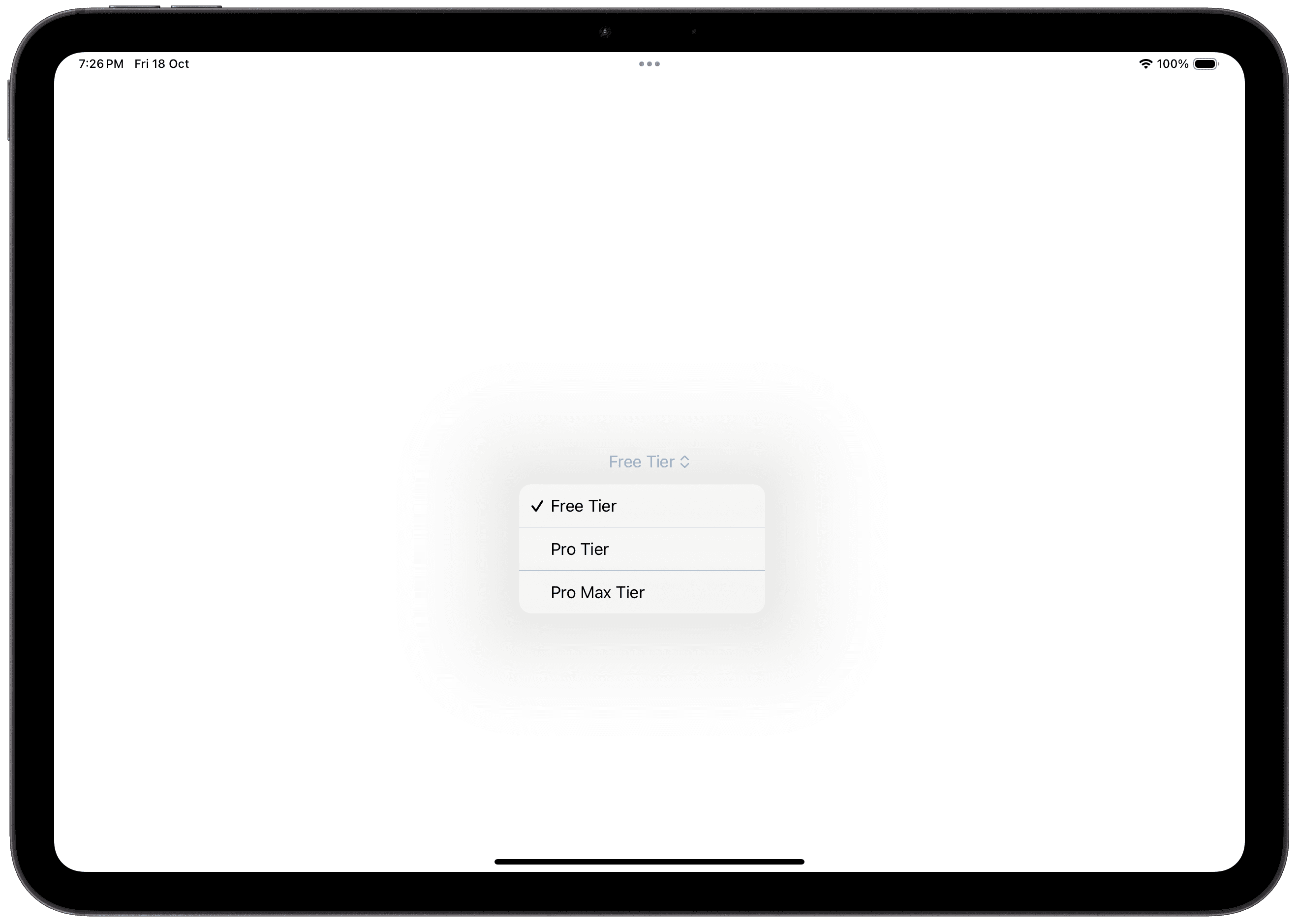
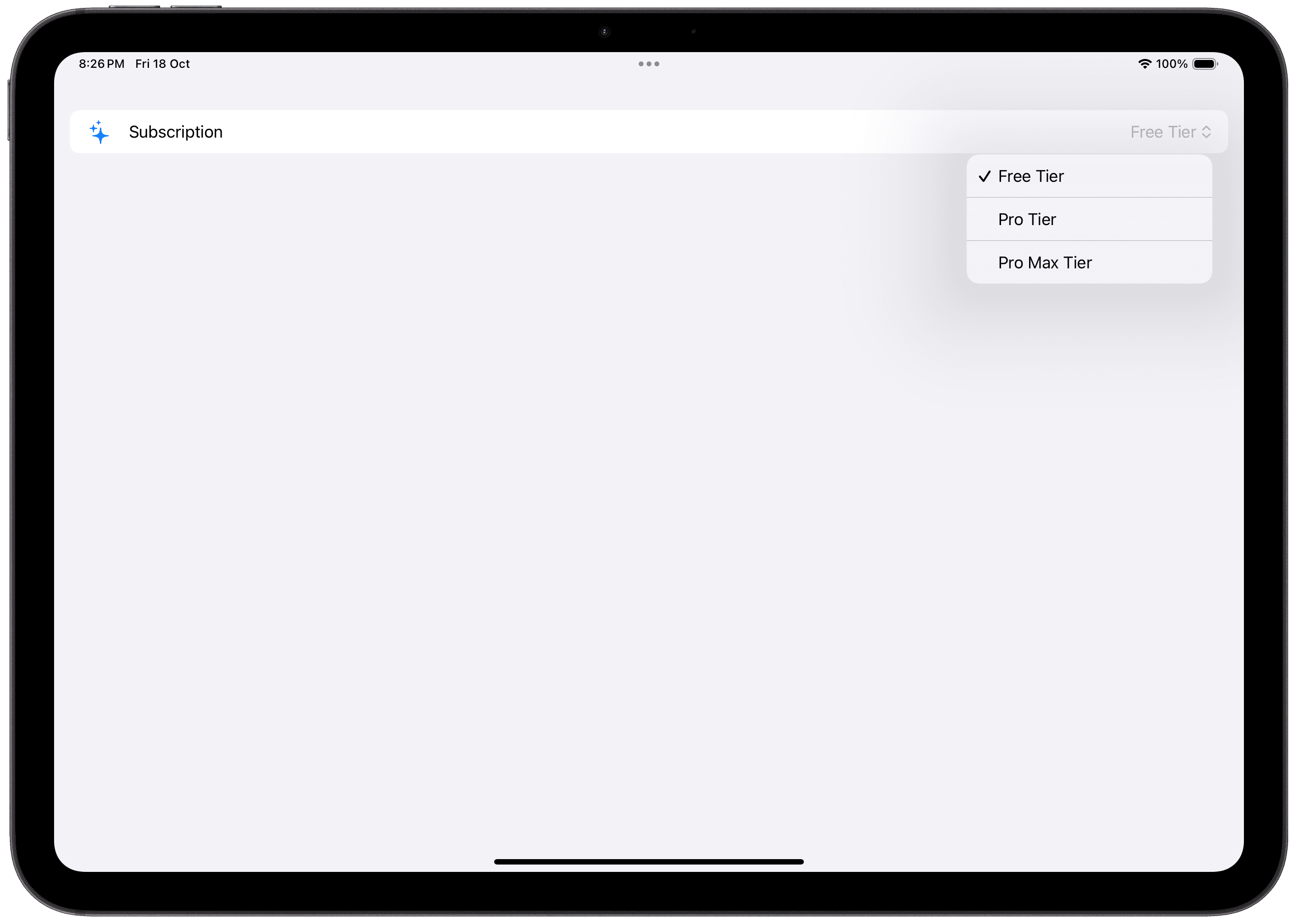
The appearance differs when inside a List or Form. In a List or Form, the label's value is visible. The label's content, while not visible when not present when outside of a List or Form, is still important as it is used as part of the assistive technologies.
Basic Pickers
Text Labels
Each picker option has to be supplied with a tag. When the option is selected, the tag value gets set to the Binding value in the selection parameter.

By default, the label is hidden. In a Form or List, the Picker's label shows up.

Text and Image Labels
You can add an image or an SF Symbol to your labels. This will only appear when inside a Form or a List. Outside of a Form or List, by default, the icon or image will be hidden.

Custom Labels
You can pass in a label closure after the Picker's options to create a custom label.

Picker Options
Using Enumerations
You can use an enumeration to set up your Picker. This is a far more elegant approach as you can use the cases in the enumeration as picker options.
To achieve this, create an enumeration. This enumeration needs to either have a Raw Value, or conform directly to the Hashable protocol. You can then supply the enumeration value as the tag.
Using ForEach
A ForEach can also be used to create the options.
In the example below, the cases in the enumeration can be given an explicit raw value corresponding to each option's title. Conforming to CaseIterable allows you to access all cases of the enumeration with the allCases static property.
A ForEach can then be used to iterate over all the cases and display them as options in the Picker.
Styling Pickers
Like other views, applying picker style is as simple as using the .pickerStyle modifier on the picker or a view containing a picker.
Individual Style Options
Inline
Standalone
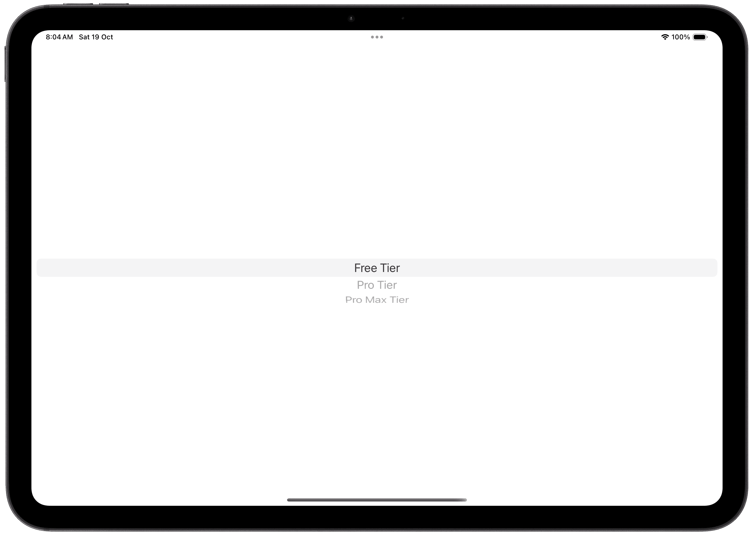
In Form / List
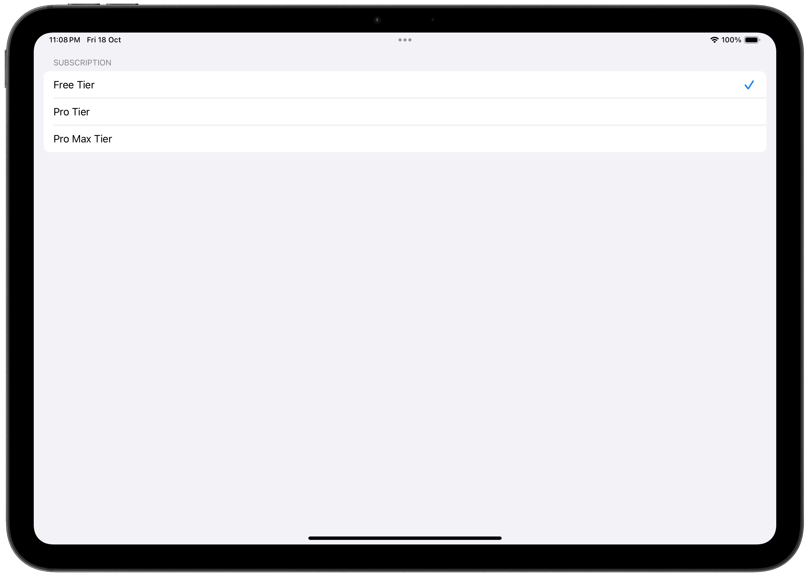
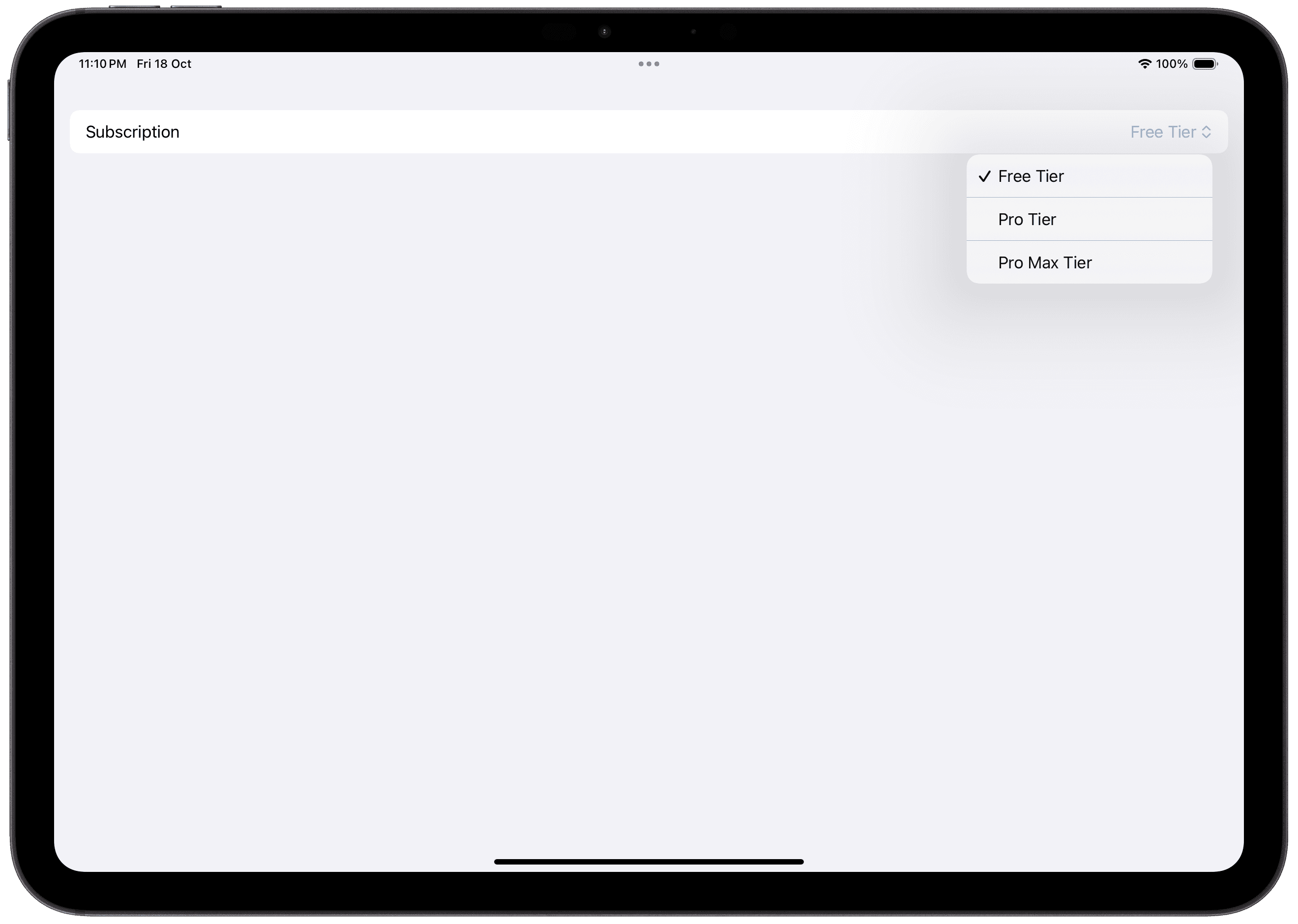
Menu
Standalone
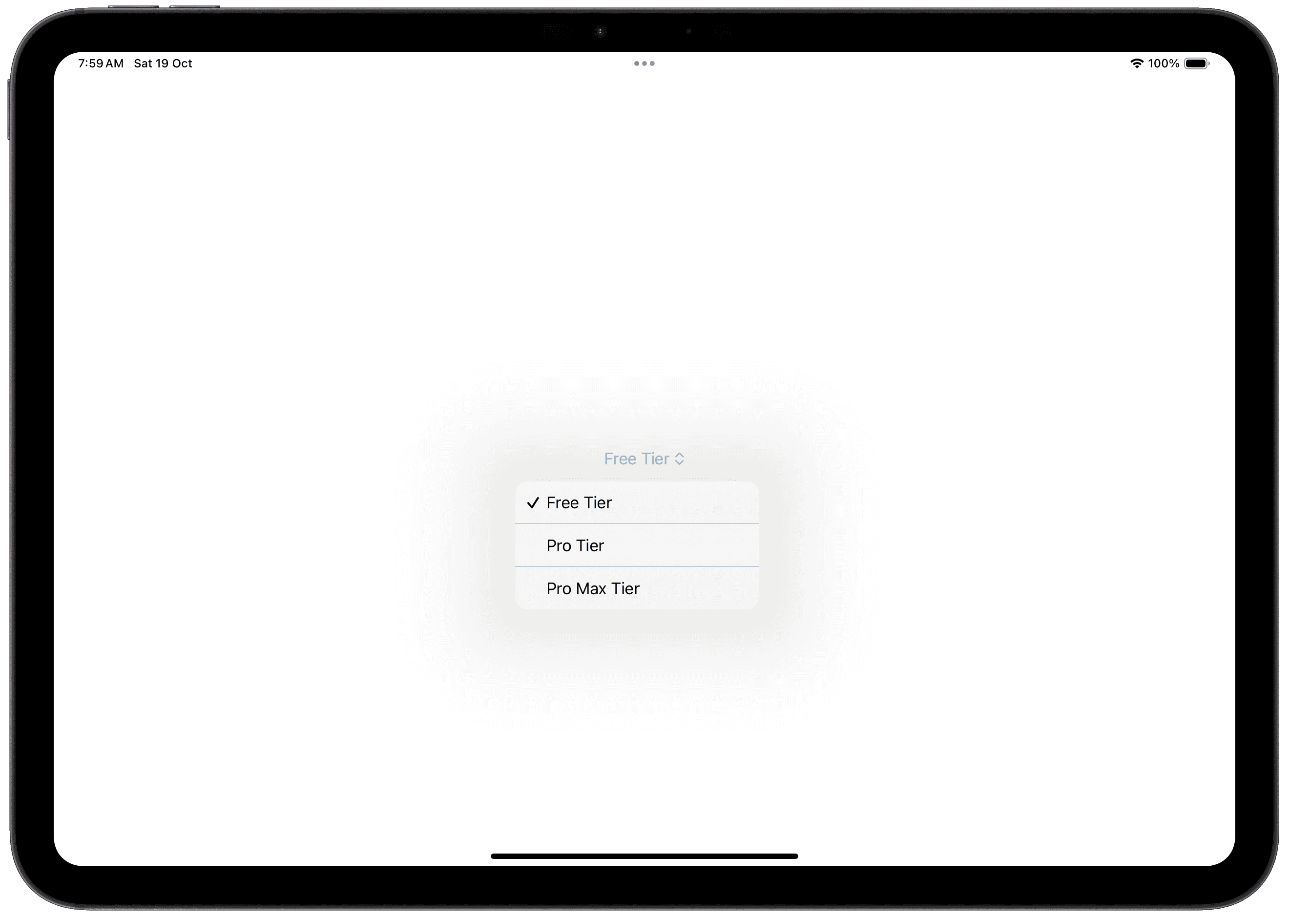
In Form / List
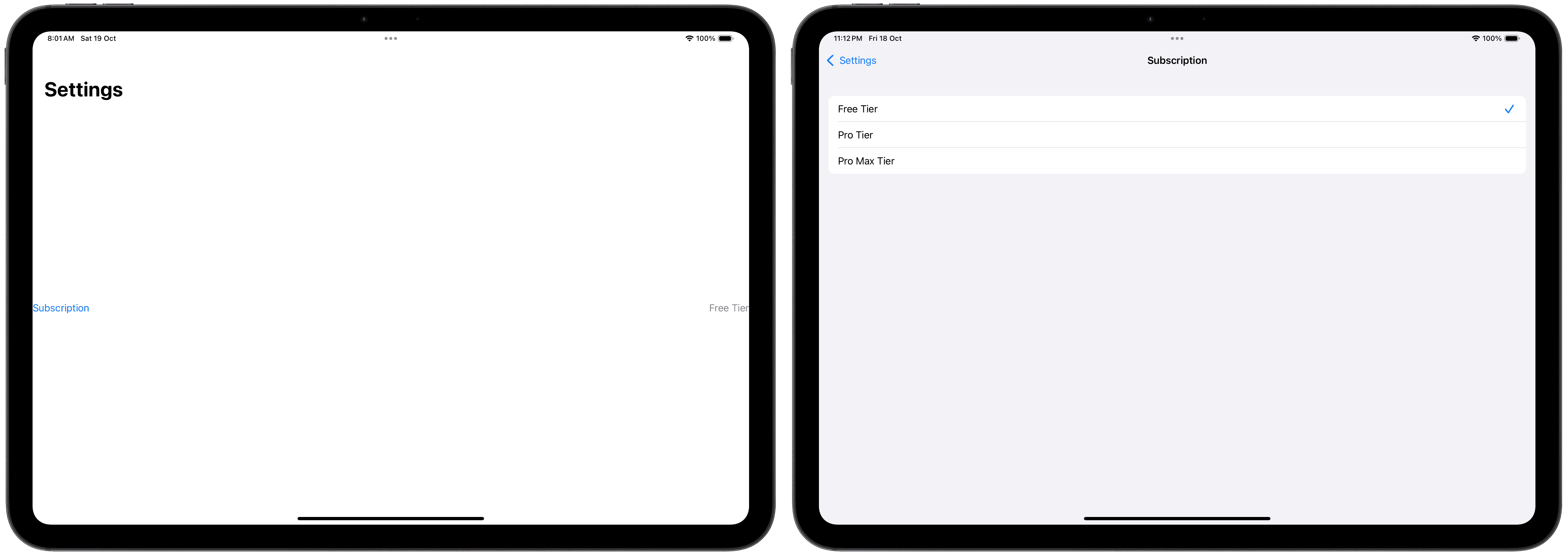
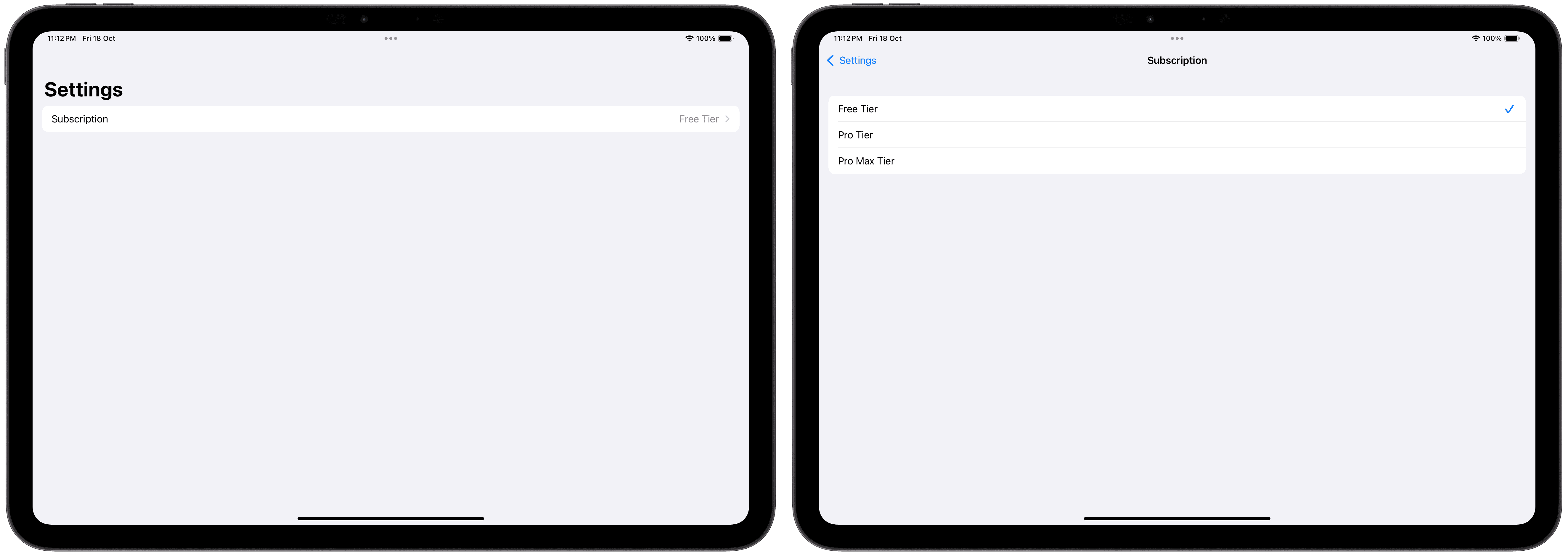
Navigation Link
When using the navigation link picker style, the Picker must be within a Navigation View, like a NavigationStack or NavigationSplitView.
Standalone
In Form / List
Palette
Standalone
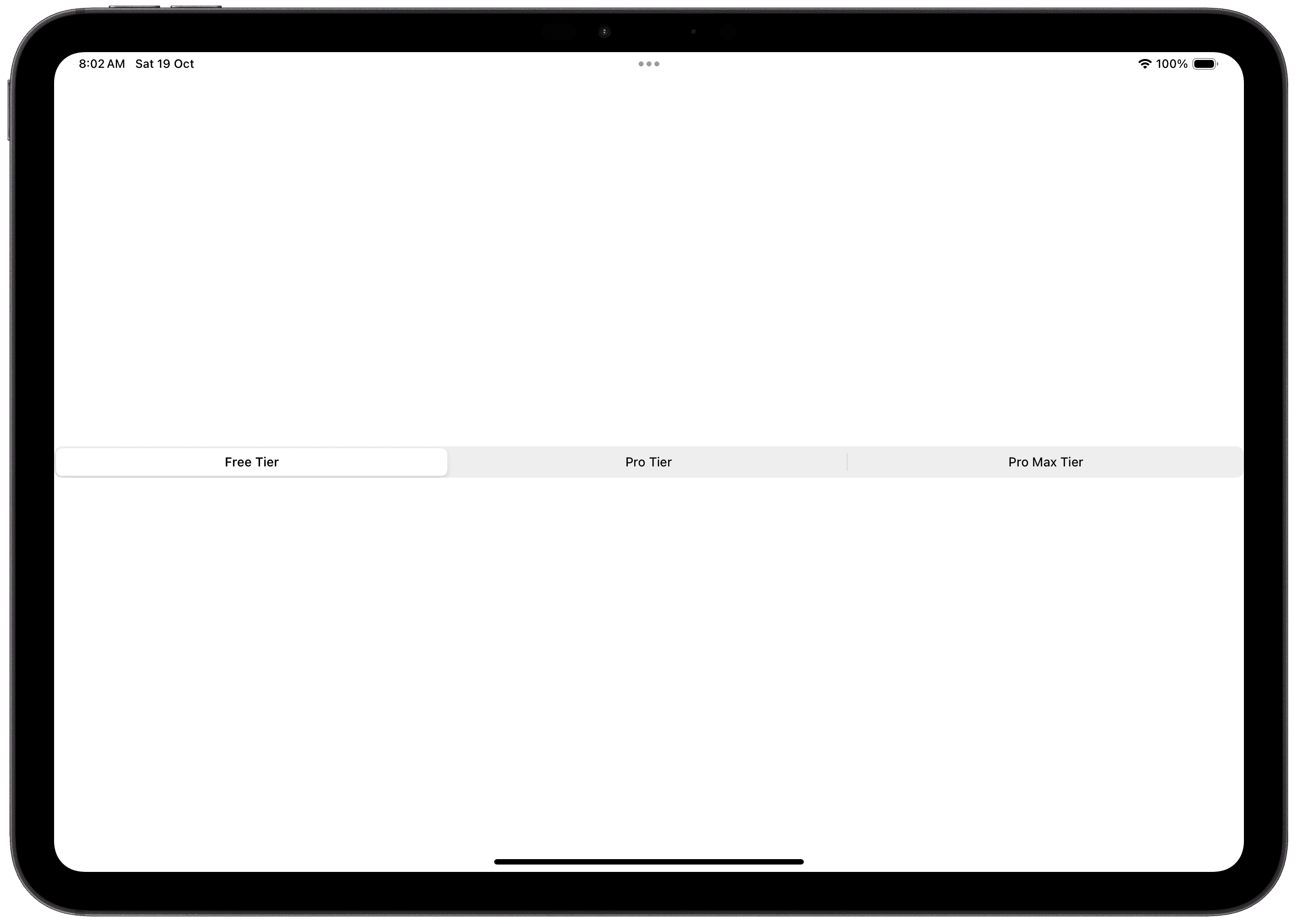
In Form / List
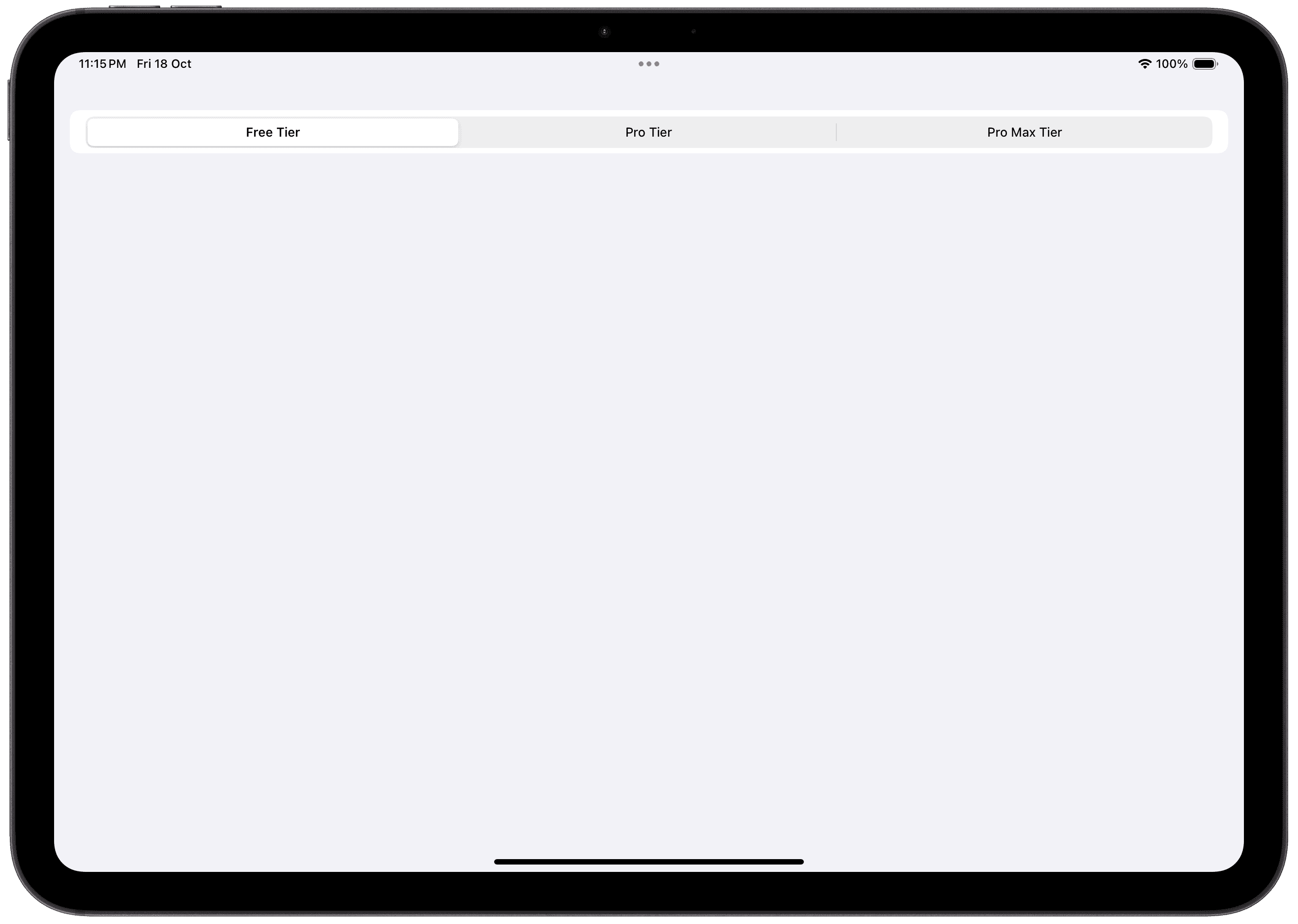
Segmented
Standalone

In Form / List

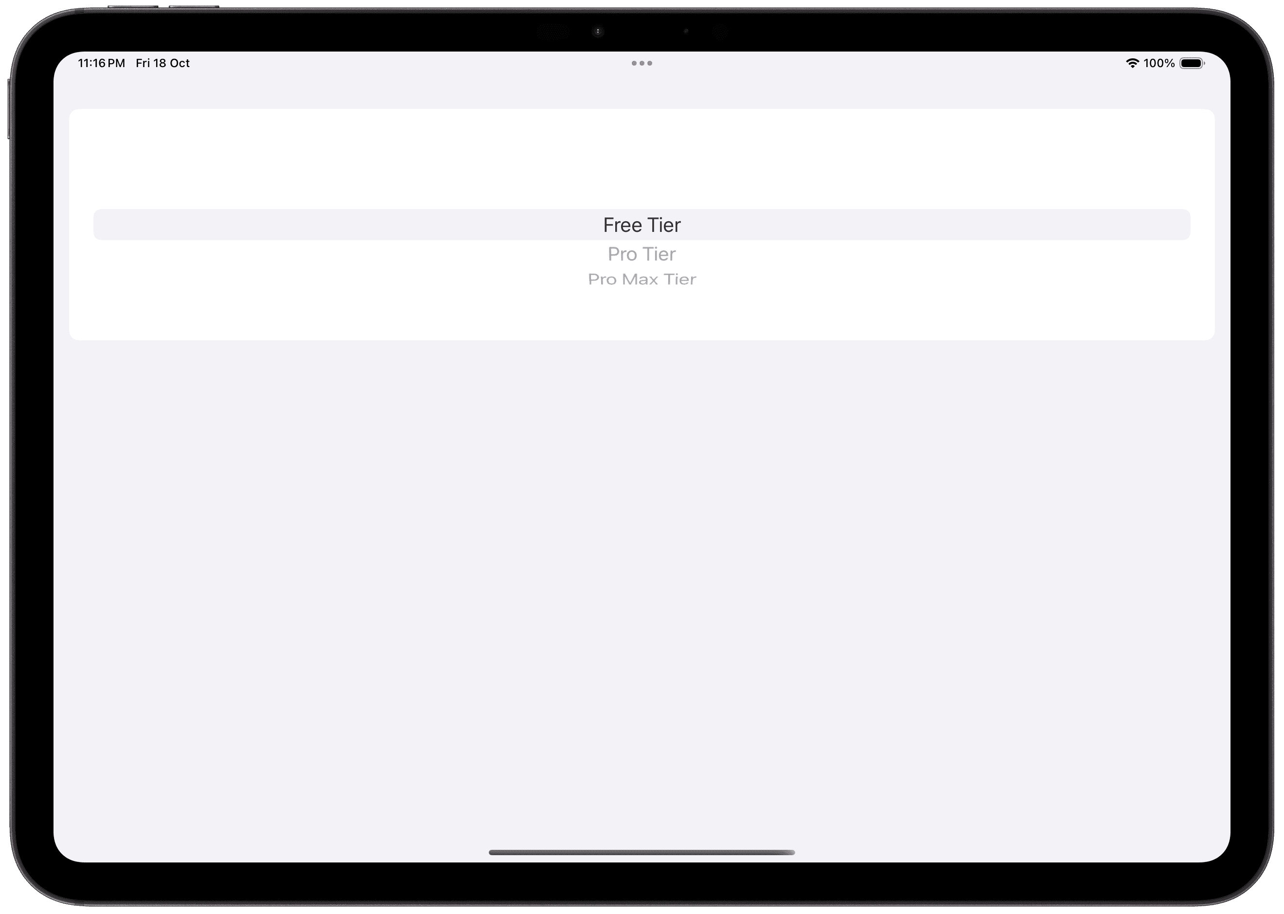
Wheel
Standalone

In Form / List
Cascading Styles
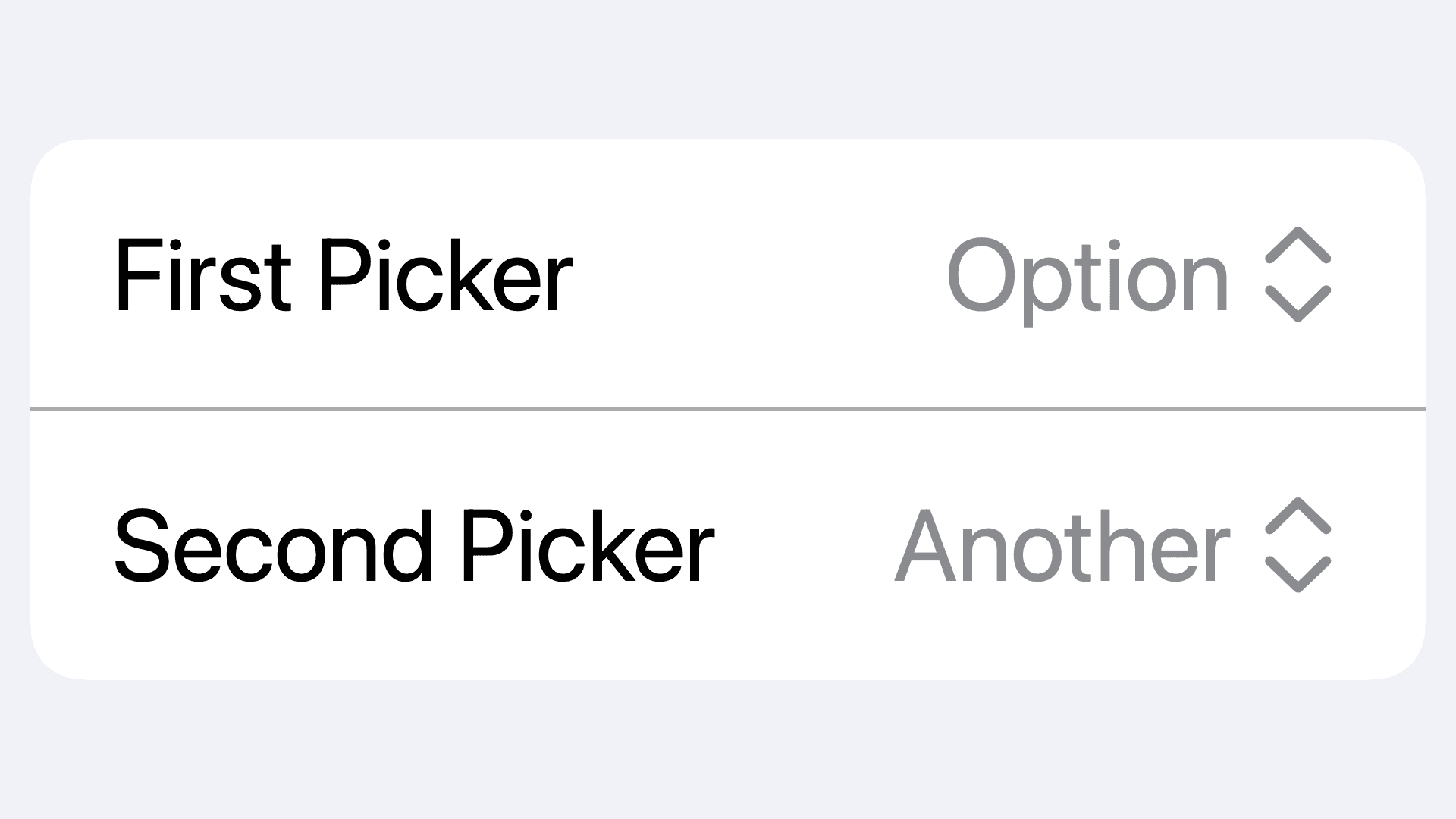
With the pickerStyle modifier, picker styles will cascade down. This allows you to attach the pickerStyle to any parent / ancestor view to have the style applied to all child views.
This can be particularly useful when dealing with forms and keeping the picker styles similar.
Pickers with Collections (work in progress)
Custom Current Value Labels (work in progress)
In These Collections
This article can also be found in these collections.


