
Video
About Sliders
Sliders are used to allow users to select a value from a continuous range by dragging the slider along. Some use cases of sliders include adjusting parameters like the opacity level of a color or the radius and intensity of a shadow.
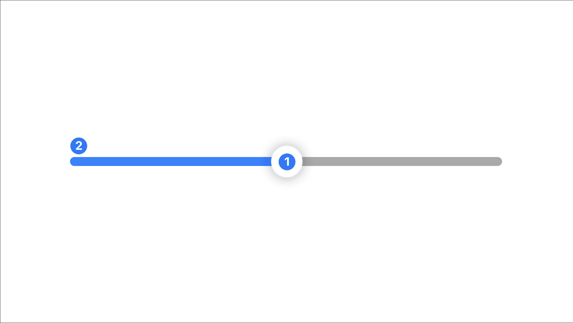
Sliders are made of 2 main components. The thumb—used to drag the slider, and the track—the area the thumb runs on.
Creating a Slider
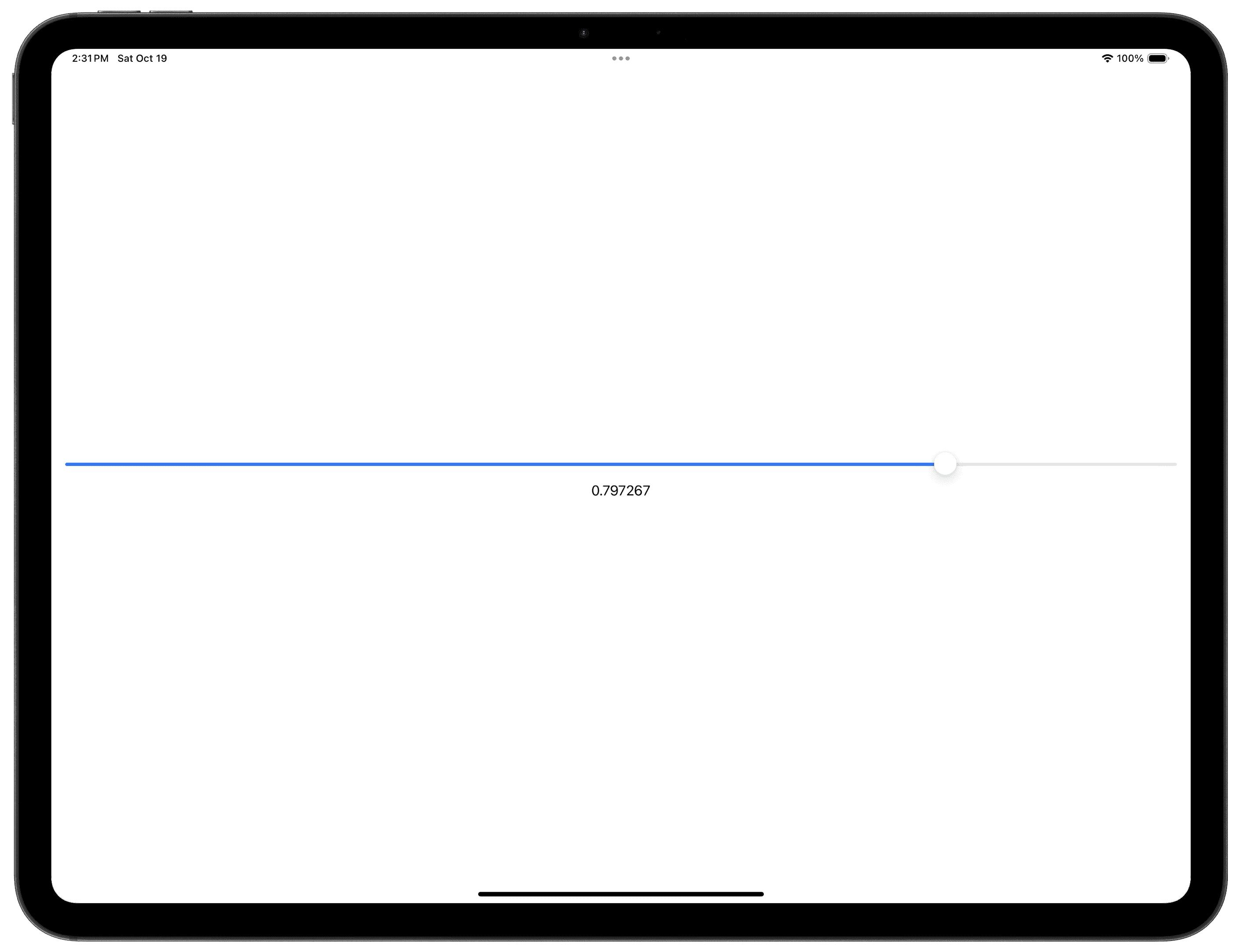
To create a Slider, you’ll need to supply it with a Binding BinaryFloatingPoint like a Double or a Float. In the example below, a Slider is created alongside a Text that displays the current value of the Slider.
Slider Basics
Range
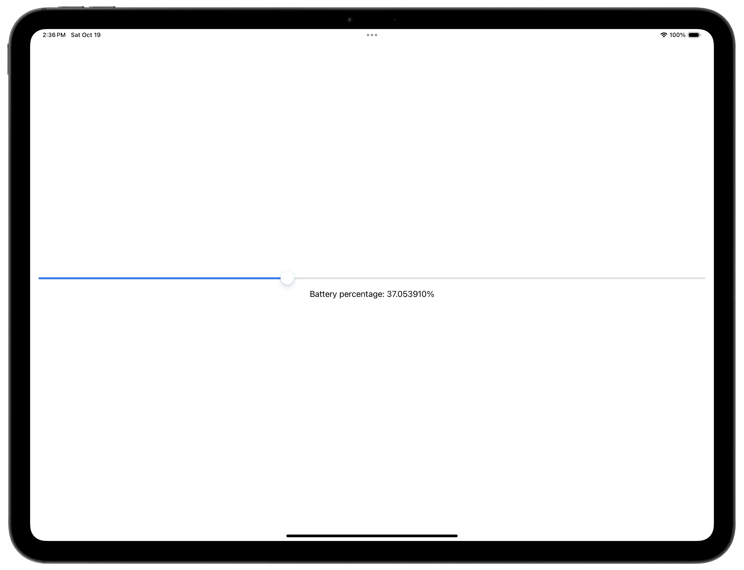
By default, Sliders have a range of 0.0 to 1.0 inclusive. To modify the range of the stepper, you can make use of the in parameter. In this example, the specified range of the Stepper is 0...100, or 0.0 to 100.0 inclusive.
You can also make use of the less than (<) mathematical symbol to denote your range. For example 10...<100 means from 10.0 inclusive to 100.0 exclusive.
Step
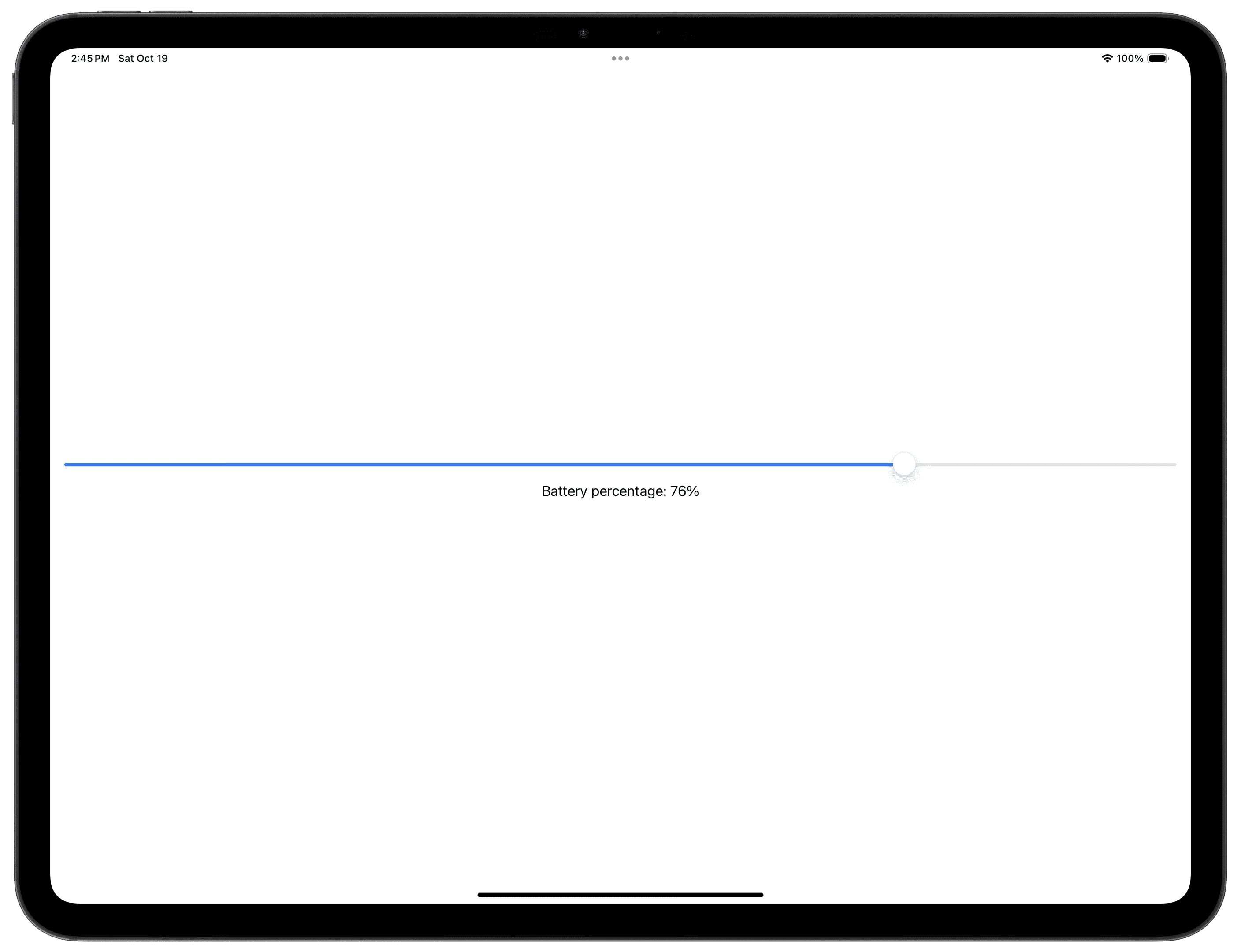
The step parameter allows you to specify how much to change the Binding value when you move the Slider. By setting step to 1, the Slider will only increase/decrease the value by 1 when moved, and the thumb of the Slider will snap to the points on the track that correspond to that value.
Listening To Editing Changes
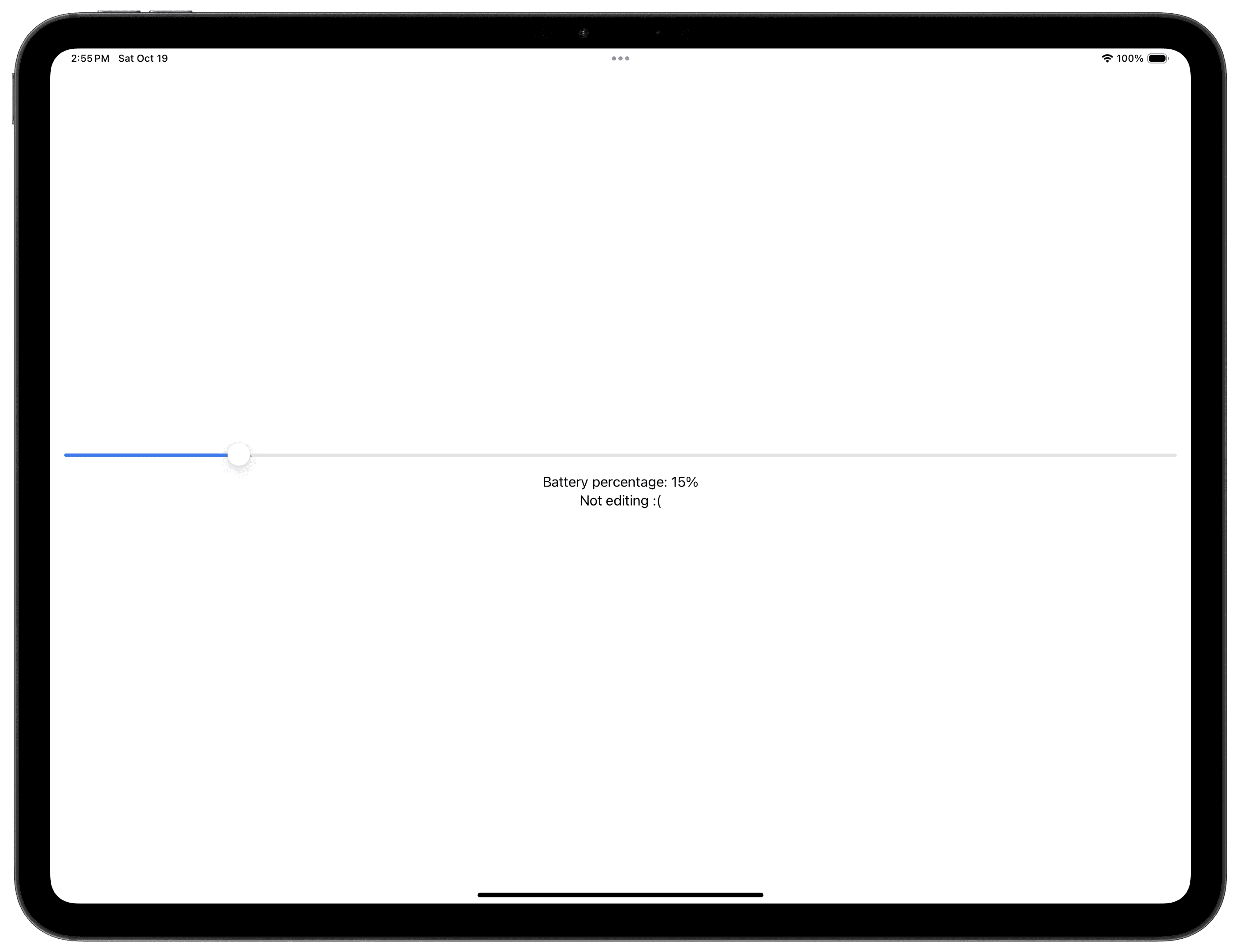
The onEditingChanged closure allows you to observe when the Slider is being dragged. The Bool closure parameter tells us whether or not the Slider is currently being dragged.
In the example below, the closure parameter has been given the name “editing”. When the Slider’s thumb is actively being dragged or held, the text will change from “Not editing :(” to “Currently being edited!”.
Minimum/Maximum Value Labels
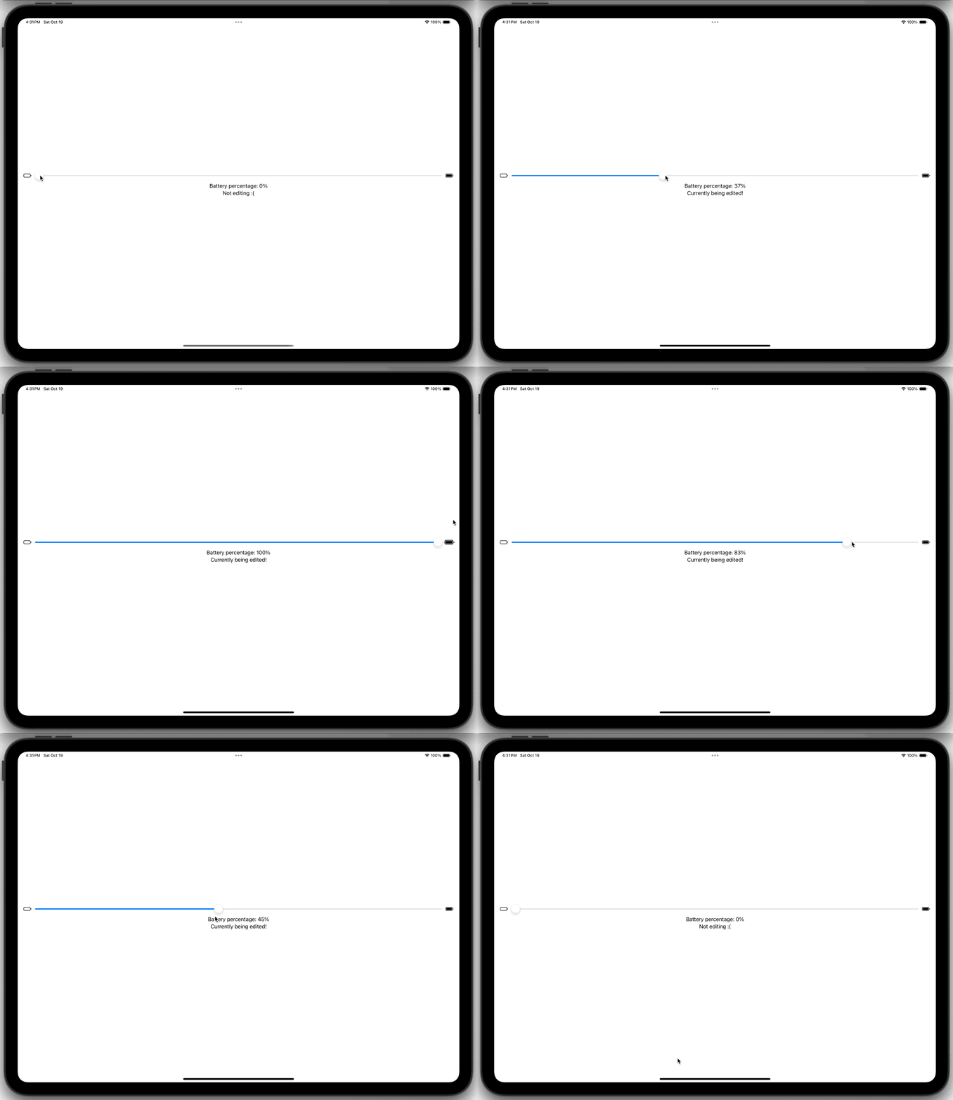
To add labels to the leading and trailing ends of the Slider, you can make use of the minimumValueLabel and maximumValueLabel closures. To use these two closures, the onEditingChange closure has to be shifted the end, and a Label that describes the purpose of the Slider has to be specified (Note: the Label supplied only appears in macOS apps).
When an SF Symbol is used for the minimum or maximum value labels, the symbol will bounce when the thumb reaches or leaves either end.
Slider Track Color
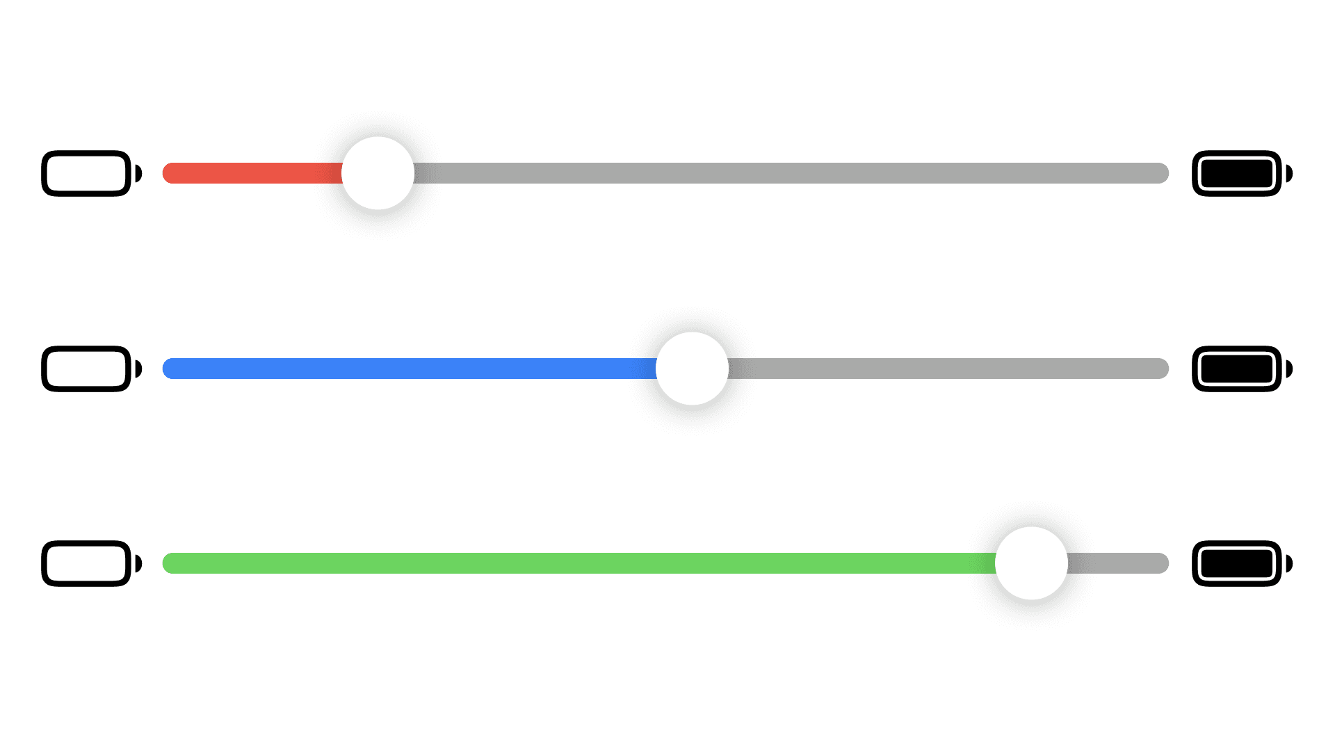
To change the Color of the slider’s track, you can use the tint modifier and supply it with a Color. In the example below, the slider’s track will turn red when it is 20% or below, green when 80% or above, or blue otherwise using a series of ternary operators.
In These Collections
This article can also be found in these collections.
See Also

Date Pickers
Use Date Pickers to select an absolute date and/or time.

Pickers
Create a picker to select one of a set of options.

State Variables
State variables are used to provide interactivity in SwiftUI.

Buttons
Create a button that responds to the user input.


